If you’ve read my blog for a while you probably know that me and my husband are not home owners, shock horror! I used to believe the lie society likes to tell that you have to own a home before you even consider settling down. I found it very refreshing to move from suburbia to London and no longer feel that cultural pressure. London is so ‘out of this world’ expensive that there is no expectation that you’ll be buying yourself a pad any time soon, if ever. It’s fully acceptable to rent indefinitely even with…hold your horses, a family! Sure, if we had the enormous wad of cash needed for a deposit then it would make a lot of sense to hoist ourselves onto the property ladder but the expectation just isn’t there and for now we can take advantage of getting someone else to do and pay for the dirty work, with the freedom to move if our needs change at comparatively little expense.
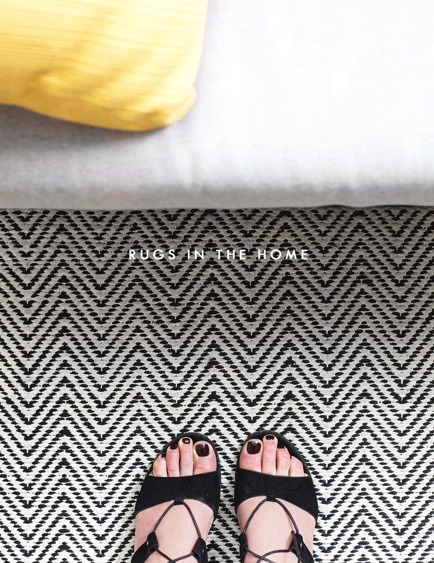
One of the downsides of renting however, is that making your house a home can only go so far and as someone who love love loves interiors and home decor, that’s a hard pill to swallow. I’ve said it before but the number one thing I would change in the flat is the ugly, dodgy quality, biscuit coloured carpets in the living, dining room and hallway. It could be a lot worse, don’t get me wrong but how I’d love to rip them up and expose the floorboards, maybe paint them white. My solution was found in the shape of a giant rug to break up the sea of biscuit. Picking a rug opened up a whole can of worms however. It’s a sizeable investment so thinking through what colours would be best, what pattern, no pattern at all, as well as the shape to maximise floor coverage. I ended up opting for a very large rug option, with a monochrome zig zag from Carpetright. My hope was that the monochrome would allow me to change our general decor slightly in the future without having to get a new rug and the tight pattern leant itself to any potential spillages, which for me was inevitable. The rug literally transformed the space and made it so much cosier and more inviting which was a win all round.
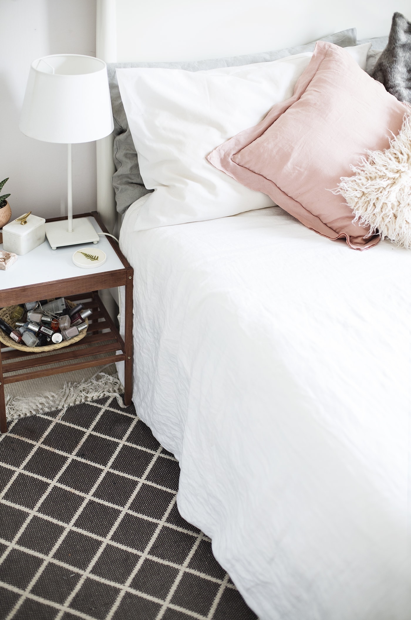
In the bedroom we have much more respectable, cream carpets. The only problem is, like I said, I spill stuff…all the time. In fact I’ve already created two stains that just won’t budge so I opted for a small rug to lie to the side of the bed. It’s simple, but having it nestle ever so slightly under the bed frame ties that space together and adds pattern into an otherwise minimal and muted room.
So how could you transform your rented space with rugs? Here’s a few options to think though…
TEXTURE TO BECKON YOU IN
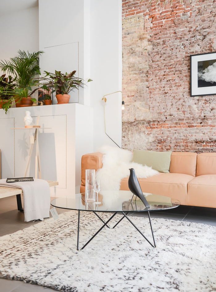
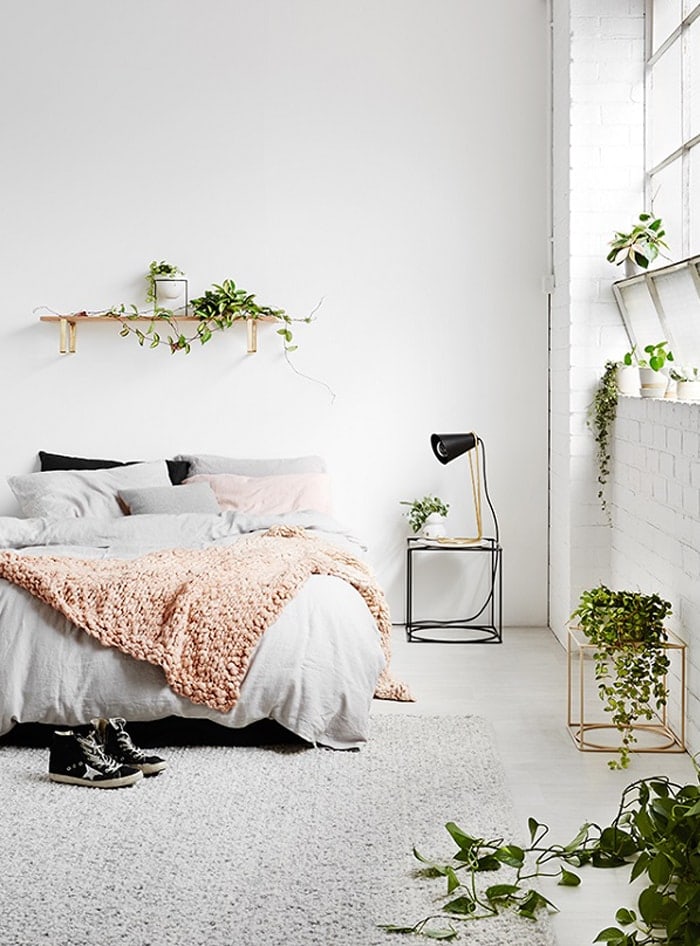
source unknown
Why not consider a subtle or neutral rug that has bags of texture. This tactile look immediately makes a room much more welcoming as it screams comfort. It can work really well with an otherwise minimal room, to keep it from looking cold and clinical. Overlap the rug under your furniture items so the room becomes cohesive, with all areas linking together, providing a mini foot hug every time you’re on the sofa or step out of bed.
Why not try Lustrous rug.
TRADITIONAL MADE MODERN
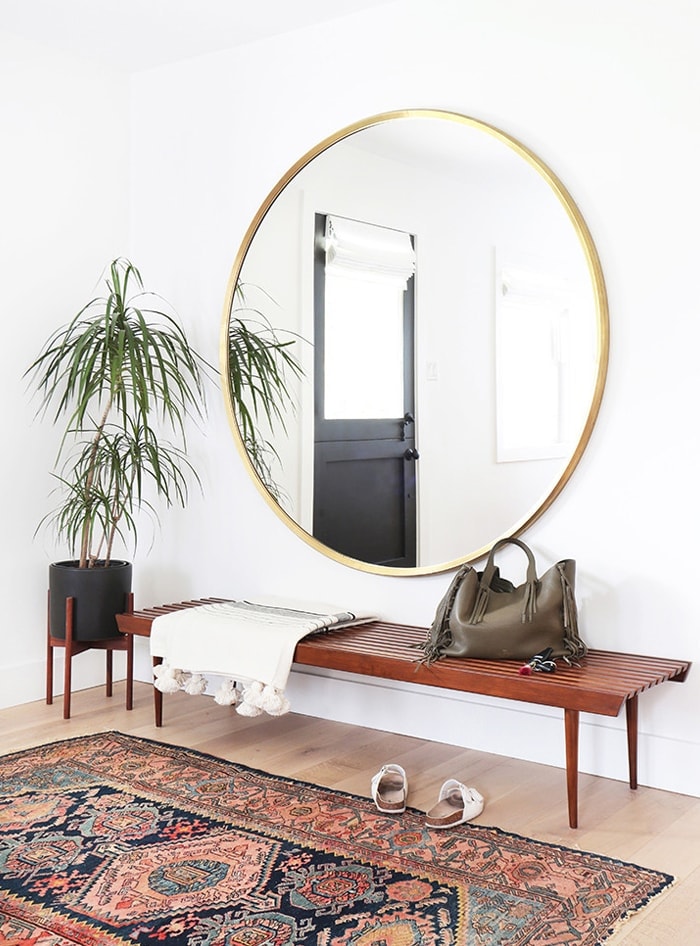
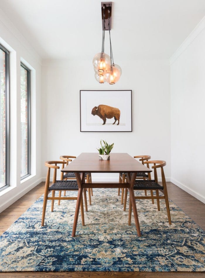
Pinterest is full of geometric rugs but why not consider a more traditional pattern to give the space a more eclectic feel. Team this with simple, Scandinavian furniture and plenty of white to bring these patterns into 2016. Let the pattern speak for itself and keep everything else clean to avoid a busy look emerging.
Why not try Eternity Traditional rug.
MONOCHROME GEOMETRICS MAKE STYLING EASY
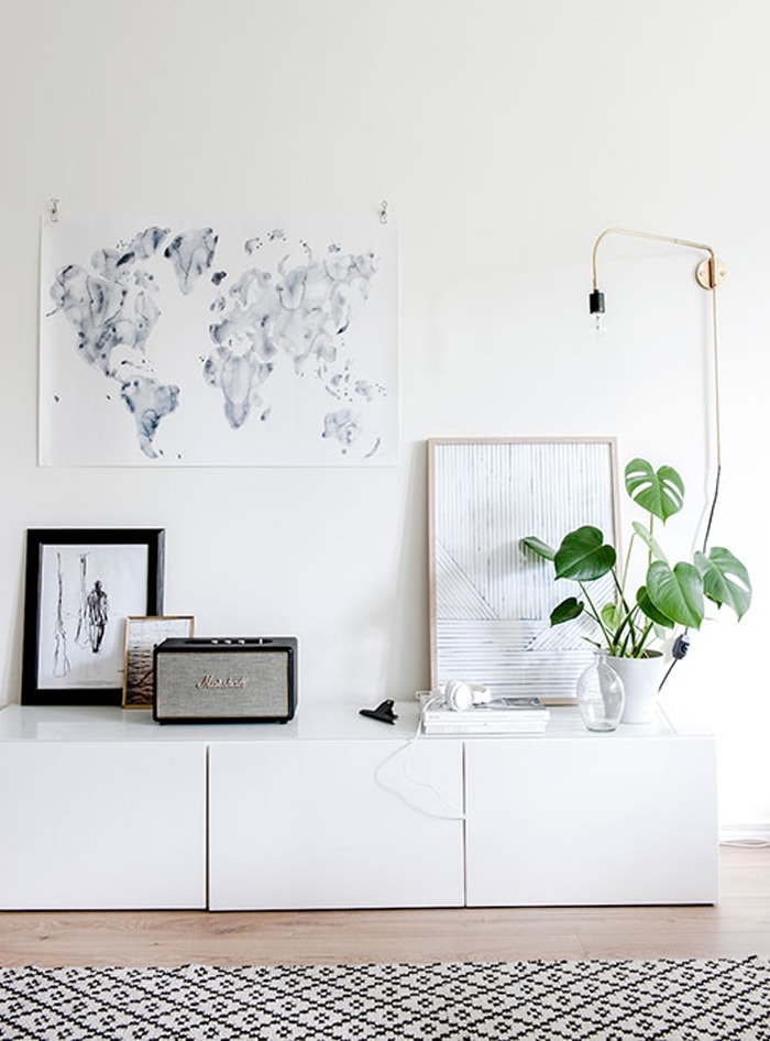
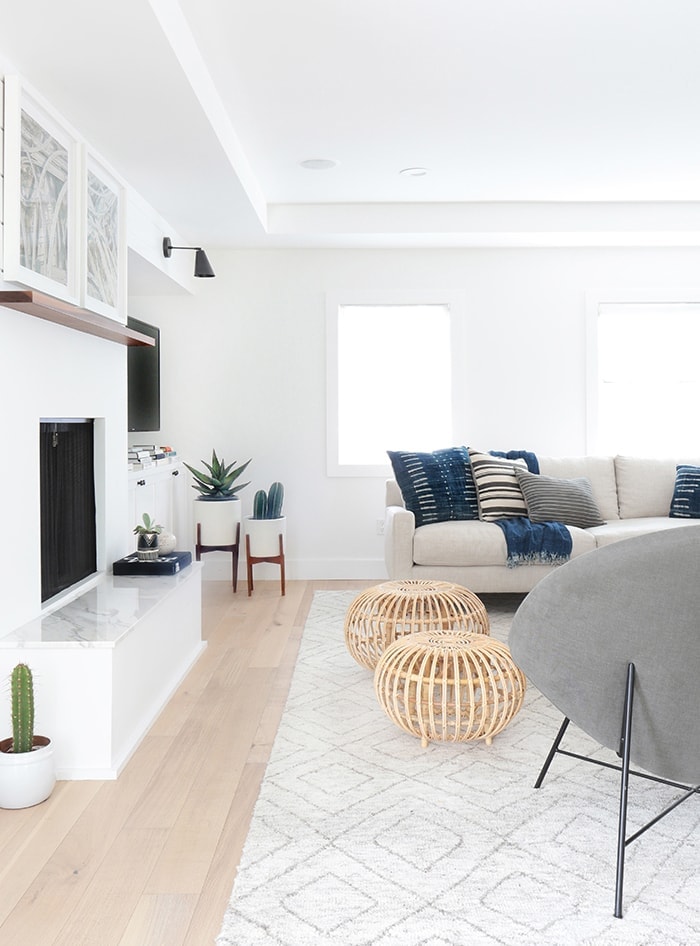
Geometrics don’t seem to be going anywhere fast and they really are an easy addition to a room. They add pattern but usually in a very simple form, meaning they usually sit nicely amongst most other home furnishings. If you don’t fancy going bold, pick a pattern in a softer grey, rather than a black.
Why not try Sloane rug in grey.
CREATE A FEATURE WITH A ROUND RUG
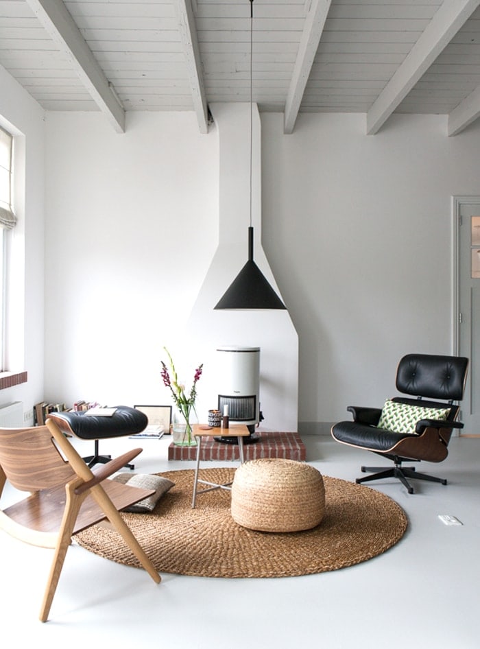
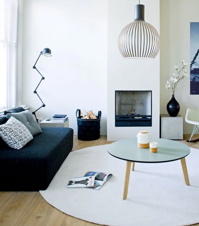
Round rugs add just that little bit of extra interest to a room and work particularly well with round tables, to mirror the shape. They create an elegant focal point and the curves soften things up. Don’t be afraid to overlap them with furniture or even overlap a smaller round rug with a larger one in two slightly different tones for added depth.
Hopefully this will give you some food for thought when picking a rug and if you don’t own one already then what are you waiting for? I’m so used to having rugs now that rooms seem empty without them. If you’ve got a lot of floor space it works particularly well for breaking up the whole room.
This post was written in collaboration with Carpetright but the voice is 100% mine.
You might also like


Original article and pictures take thelovelydrawer.com site
Комментариев нет:
Отправить комментарий